"Design is just about making things look pretty, right?" — This misconception is still common, and it's a costly one for businesses that believe it. In 2026, UI/UX design has been proven by data to be one of the highest-ROI investments a digital business can make.
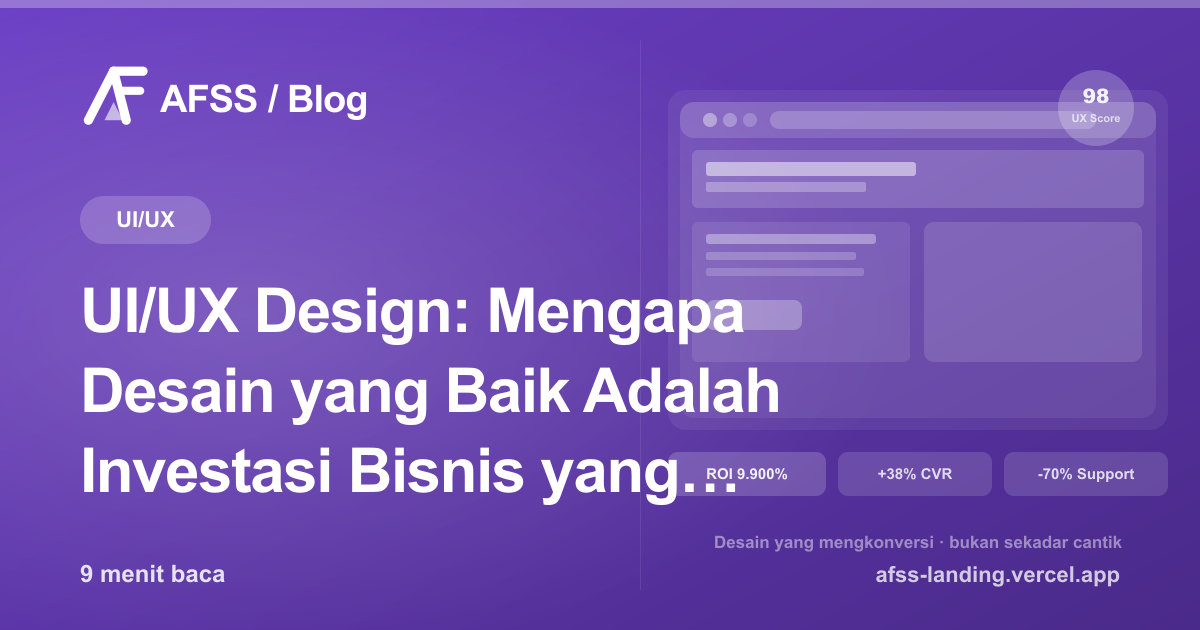
A study by Forrester Research found that every $1 invested in UX returns an average of $100 — a 9,900% ROI. That number isn't magic: it's the result of fewer support calls, more conversions, higher user retention, and lower development costs from rework.
Understanding the Difference Between UI and UX
These two terms are often used together, but they're actually different:
UI (User Interface) is the visual and interactive side of a digital product: colors, typography, icons, buttons, layout, and every element users see and click. Good UI makes a product look professional, consistent, and appealing.
UX (User Experience) is the overall experience a user has while interacting with a product: is it easy to find? Is the process intuitive? Do users reach their goal without frustration? Good UX makes a product feel natural and efficient to use.
A common analogy: UI is like a car's interior (does the dashboard look good and clear?), while UX is like the overall driving experience (is the car easy to drive, safe, and does it get you to your destination comfortably?).
The two can't be separated: beautiful UI with poor UX (a confusing flow) will frustrate users and drive them away. Good UX with poor UI (a sloppy-looking design) will reduce trust in your product.
The Real Cost of Bad UI/UX
Poor design isn't just "not pleasant to look at" — it has very real financial consequences:
Low Conversion Rates
A study by the Baymard Institute found that the average 69.8% cart abandonment rate in e-commerce is caused by poor UX: checkout processes that are too long, too many form fields, no guest checkout option, or an unconvincing design. That's sales simply slipping away.
High Support Costs
When users can't find the function they're looking for, they contact customer support. Each support call can cost Rp 50,000–200,000 per ticket. With thousands of users, this becomes a significant operating cost — and most of it is preventable with more intuitive design.
Expensive Rework Costs
IBM found that fixing a bug or design issue discovered after production can be 100 times more expensive than catching and fixing it during the design phase. Investing in UX research and prototyping early on is far more efficient than reworking a product that's already been built.
Lost Users and Revenue
Frustrated users don't come back. In the social media era, they might even share their bad experience with others. Every user lost to poor UX is lifetime value you'll never get back.
Principles of Effective UI/UX Design
1. User-Centered Design
Every design decision starts with the question: "What does the user need?" — not "What do we want to show?" This means user research (interviews, surveys, analytics) should be the foundation of design, not internal assumptions.
2. Clear Visual Hierarchy
The human eye naturally follows certain patterns. Good design leverages this by visually prioritizing information: the most important elements (headlines, CTAs) stand out, supporting information is smaller and lighter. Users shouldn't have to think hard about what to read or click first.
3. Consistency
Same elements should behave the same way throughout the product. A red button always means a risky action. A specific icon always means the same function. Consistency builds a strong mental model in users so they can "navigate" the product without having to relearn it every time.
4. Clear Feedback
Every user action should get a clear response: a button changes when clicked, a loading indicator appears while data is processing, informative success or error messages. Without clear feedback, users don't know whether their action succeeded or not.
5. Minimizing Cognitive Load
The human brain has limited capacity to process information at once. Good design minimizes cognitive load: simplify choices, reveal information progressively, use familiar language. Miller's Law: humans can process about 7 (±2) pieces of information at a time.
6. Accessibility
Good design can be used by everyone, including people with visual, motor, or cognitive limitations. This isn't just an ethical obligation — it also expands your product's reach. The WCAG (Web Content Accessibility Guidelines) standard is the benchmark to aim for.
7. Mobile-First Design
In Indonesia, the majority of internet users access the web through their phones. Mobile-first doesn't mean building a mobile version after finishing the desktop version — it means designing for the phone screen first, then expanding to larger screens.
The Professional UI/UX Design Process
Good design isn't an accident — it's the result of a structured process:
1. Research & Discovery (1–2 Weeks)
- User interviews: Direct conversations with potential users to understand their pain points, goals, and mental models
- Competitive analysis: Analyzing competitors' design and UX — what works, what doesn't
- Analytics review: If the product already exists, analytics data reveals where users drop off or spend a lot of time
- Stakeholder interviews: Understanding business goals and technical constraints from the internal team
2. Information Architecture (1 Week)
Designing the information structure and navigation of the product: what content exists, how it's organized, how users move from one section to another. Output: sitemap, user flows, and card sorting results.
3. Wireframing (1–2 Weeks)
Low-fidelity sketches of the interface showing layout and structure without visual detail. Wireframes allow for fast, cheap iteration before investing in visual design. Tools: Figma, Sketch, Balsamiq.
4. Prototyping & User Testing (1–2 Weeks)
An interactive prototype real users can "click through." User testing with 5–8 users is usually enough to identify 85% of existing UX issues. These findings are used to iterate the design before development begins.
5. Visual Design (2–3 Weeks)
High-fidelity design with colors, typography, icons, and all visual elements. Includes building a design system that ensures consistency across the entire product.
6. Design Handoff & Spec
Developers receive a complete design spec: sizes, colors (in hex/HSL code), spacing, interactions, and required assets. Modern tools like Figma let developers view specs directly from the design file without needing separate documentation.
Tools Used in UI/UX Design
Design and Prototyping:
- Figma: Today's industry standard — real-time collaboration, prototyping, and design handoff all in one platform
- Adobe XD: Adobe's alternative with strong integration into the Adobe ecosystem
- Framer: For more interactive prototyping that closely resembles the real product
Research and Testing:
- Hotjar: Heatmaps and session recordings to understand how users behave on your website
- Maze: A user testing platform that enables remote testing with real users
- Lookback.io: A platform for moderated user interviews and usability testing
Design System:
- Storybook: For documenting and organizing UI components
- Zeroheight: Design system documentation the whole team can read
Measuring Design Effectiveness
Good design has to be measurable. Metrics to track:
- Conversion rate: What percentage of visitors take the desired action (buy, sign up, contact)
- Bounce rate: What percentage of visitors leave after viewing just one page
- Time on task: How long it takes users to complete a specific task
- Error rate: How often users make mistakes while using the product
- CSAT/NPS: Satisfaction level and likelihood to recommend the product
- Support ticket rate: How many support tickets come in related to usability
Track these metrics before and after design changes to measure real impact.
UI/UX for Business Websites
For a business website, the UI/UX principles with the biggest impact on conversion:
- A clear headline within the first 5 seconds: Visitors should immediately understand what you offer and who it's for
- A prominent, clear CTA: One main desired action, with a button that's impossible to miss
- Strategic social proof: Testimonials, client logos, or numbers that build trust
- Simple navigation: Don't make users think about where to go
- Fast loading: Every extra second of loading reduces conversion — this also ties into website speed optimization
- A flawless mobile experience: Over 60% of traffic comes from phones — if the mobile experience is bad, you lose the majority of your visitors
When Should You Invest in UI/UX?
The answer: always, but especially:
- When building a new digital product (investing before development is far cheaper)
- When conversion rate or user retention is declining
- When usability complaints are rising
- When there's a significant redesign or new feature
- Before a major marketing campaign (the traffic you get won't convert if the UX is poor)
Conclusion
UI/UX isn't a luxury — it's the foundation of a successful digital product. Businesses that ignore design are leaving money on the table and handing it to competitors.
At AFSS, every website and app we build starts with thorough UX research and design — not just "writing the code that was requested." That's what sets apart a website that converts from one that merely exists. Get a free consultation to discuss a UI/UX strategy for your digital product.
Have a similar project?
Free consultation, no commitment. Tell us what you need — we'll help you find the best solution.
Free Consultation