In Indonesia, more than 70% of internet traffic comes from smartphones. This isn't just a statistic — it's a fundamental shift that should change how every business builds its digital presence. A website designed without considering the mobile experience is a website that's already lost before the fight even begins.
This article explains what mobile-first design is, how it differs from simply being "responsive," and the practical steps to building a website that truly performs well on every device.

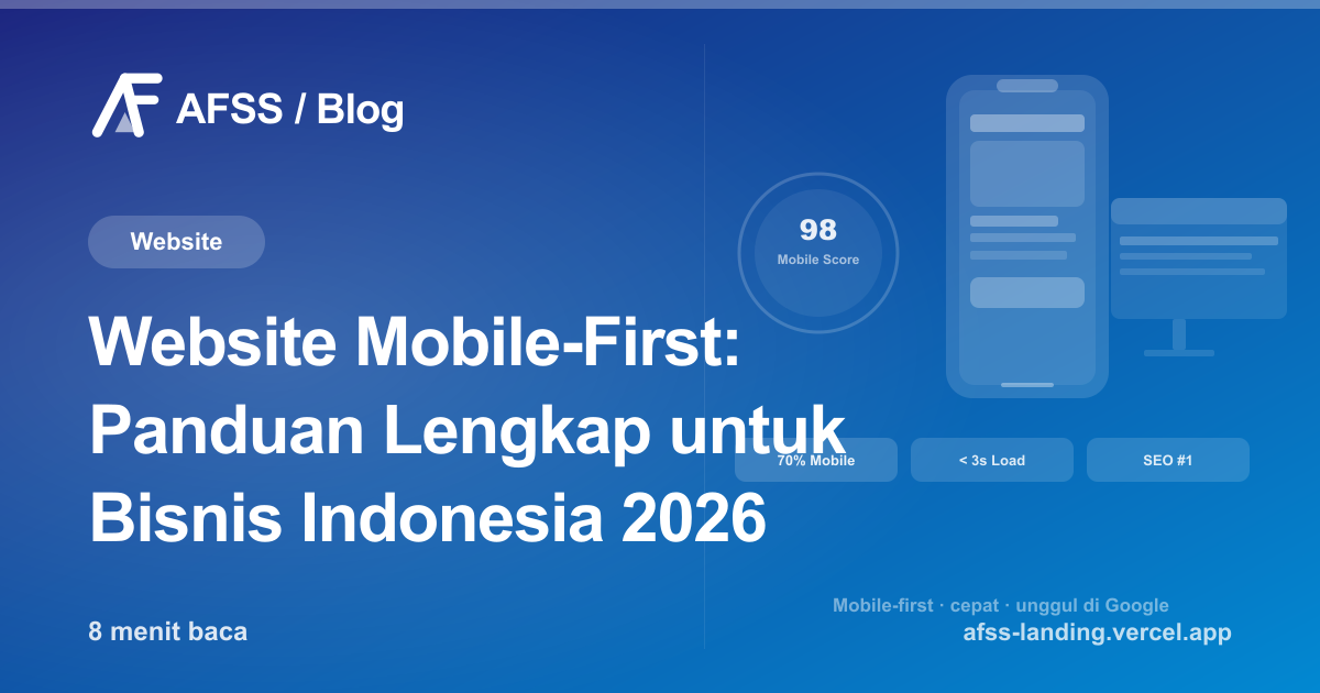
What Is Mobile-First Design?
Mobile-first is a design approach where you start with the mobile version first, then expand the design for larger screens (tablet, desktop). This is the opposite of the traditional approach of designing for desktop first, then "shrinking" it for mobile.
Responsive vs. Mobile-First: What's the Difference?
Many people think responsive design and mobile-first are the same thing. But there's a fundamental difference:
- Responsive design: A desktop website that "adjusts" its layout on smaller screens. The result is often shrunken elements, a reshaped navigation, and performance on mobile that stays slow because it's still loading assets meant for desktop.
- Mobile-first design: A website that starts from mobile users' needs — what content matters most? What actions do people most often take on their phone? Additional features are then added for the desktop version.
The results are very different. Mobile-first produces a website that's light, fast, and intuitive on a phone — not just a "shrunken" desktop site.
Why Does Google Prioritize Mobile-First?
Since 2019, Google has officially used Mobile-First Indexing — meaning Google indexes and evaluates your website based on its mobile version, not its desktop version. If your website's mobile version is slow, has incomplete content, or is hard to navigate, its SEO ranking will be directly affected.
This means a slow mobile website isn't just a user experience issue — it's a business problem that directly affects how easily potential customers can find you on Google.
Metrics Google monitors for mobile:
- Core Web Vitals (LCP, FID/INP, CLS) — speed and visual stability
- Mobile-friendliness — can text be read without zooming? Are buttons big enough to tap with a finger?
- Content parity between the mobile and desktop versions
Key Elements of a Mobile-First Website
1. Proper Viewport and Scaling
The first step is making sure the viewport tag is set correctly in the HTML. Add this meta tag to the head of your website:
<meta name="viewport" content="width=device-width, initial-scale=1.0">
This tells the browser to use the device's actual width as the reference, instead of a shrunken desktop width.
2. Readable Typography
On a small screen, the wrong typography makes users close the page immediately. Minimum standards:
- Body font size of at least 16px — below that, users are forced to zoom
- Line height of 1.5–1.6 for readability
- Minimum color contrast of 4.5:1 (WCAG AA)
- Avoid overly thin fonts on dark backgrounds
3. Sufficiently Large Touch Targets
Human fingers aren't mouse cursors. Touch targets (buttons, links, checkboxes) should ideally be at least 44×44 pixels, per Apple and Google recommendations. Buttons that are too small are one of the biggest reasons users get frustrated and leave a website.
4. Simple Navigation
Desktop navigation with 7 items can become a hamburger menu on mobile — but make sure:
- The menu is easy to open and close
- No elements overlap
- The main CTA is always visible (sticky header or sticky CTA button)
5. Optimized Images and Media
Large images are a mobile performance killer. Best practices:
- WebP format — 25–34% smaller than JPEG/PNG at the same quality
- Lazy loading for images not visible in the first viewport
- Responsive images using the srcset attribute so the browser loads the appropriate size
- Avoid autoplaying video that eats up data
6. Mobile-Friendly Forms
Forms are a critical conversion point. On mobile:
- Use the right input type (tel for phone numbers, email for email addresses) — this brings up the appropriate keyboard
- Keep forms as short as possible — remove any field that isn't truly necessary
- The submit button should be large and easy to tap
How Mobile Performance Impacts Conversion
Data from Google and various studies consistently shows:
- 53% of mobile users abandon a page if it takes longer than 3 seconds to load
- A website that loads 1 second faster boosts conversion by 2–4%
- A poor mobile experience means 62% of users won't buy from that brand again
In other words, mobile website speed isn't about aesthetics — it's directly tied to revenue.

How to Measure Your Website's Mobile Performance
Some free tools you can use:
Google PageSpeed Insights
pagespeed.web.dev — in-depth Core Web Vitals analysis, a performance score from 0–100, and specific recommendations. Enter your website's URL and select "Mobile."
Google Search Console
If your website is already registered with Search Console, there's a "Core Web Vitals" report showing which pages pass and which have issues.
Chrome DevTools
Press F12 in Chrome, select the "Lighthouse" tab, check "Mobile," and run the audit. The results are comprehensive — from performance to accessibility.
A Mobile-First Checklist for Business Websites
Here's a practical checklist you can use to evaluate your website:
Display & Navigation
- Text is readable without needing to zoom
- Buttons and links are easy to tap with a finger
- Navigation doesn't block content
- No content is cut off or overflows the screen
Performance
- Loads in under 3 seconds on a 4G connection
- Images are optimized (WebP, lazy loading)
- No excessive redirects
- Core Web Vitals are in "Good" status
Content
- The CTA is clearly visible without much scrolling
- Contact/order forms are easy to fill out
- Phone numbers can be tapped to call directly
- Addresses can be tapped to open in maps
SEO
- The meta viewport tag is present
- Mobile content isn't less complete than the desktop version
- Structured data (Schema.org) is present on the mobile version
An Investment Worth Making
Building a website that's truly mobile-first isn't just about a layout that "adjusts." It involves planning content from a mobile user's perspective, optimizing performance at the code level, and testing on a variety of real devices.
At AFSS, every website we build is mobile-first by default — not an add-on feature, but our baseline standard. A website that's slow or hard to use on a phone isn't a good product, no matter how beautiful it looks on desktop.
Want to know how "mobile-friendly" your current website really is? Or ready to build a new one to 2026 standards? Get a free consultation here — we can audit your existing website at no cost before any further discussion.
Have a similar project?
Free consultation, no commitment. Tell us what you need — we'll help you find the best solution.
Free Consultation